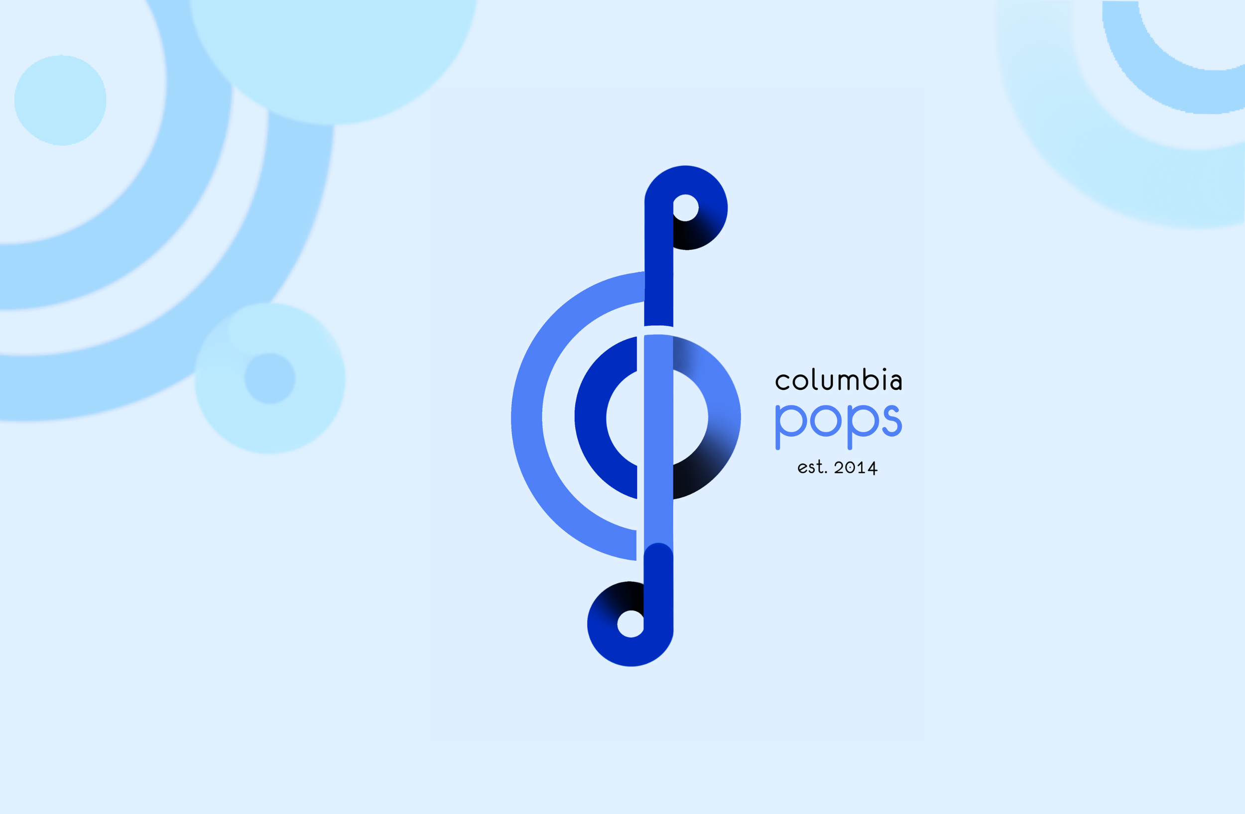
Columbia Pops’s Logo Design
Creating a professional-looking and minimalistic logo for Columbia University’s premier pops orchestra
Date: August 2023
Role: Graphic Designer (sole, open competition with 6 submissions)
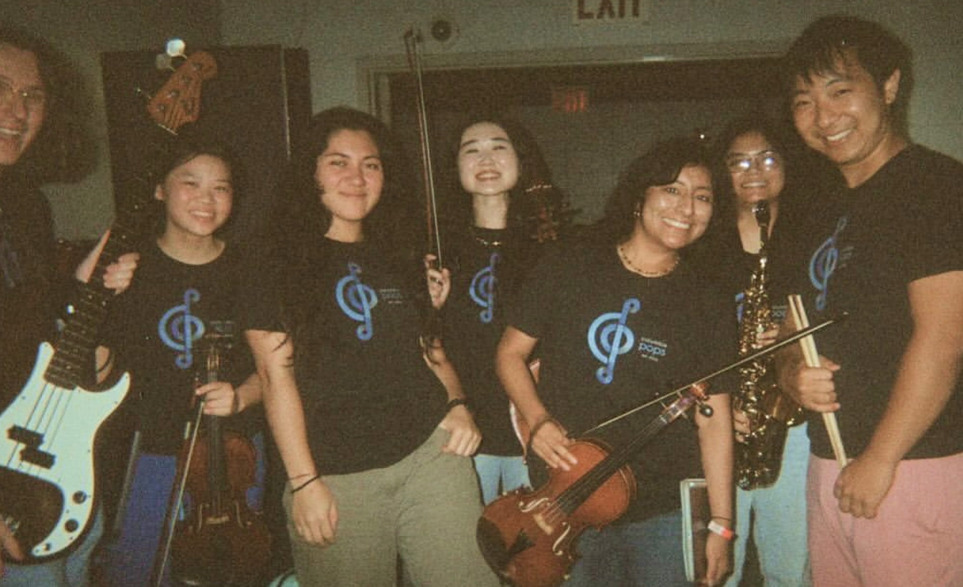
Result: Launched design used across YouTube, Instagram, and T-Shirts
Why a New Logo?
Columbia Pops’ previous logos are cute and used across various social media platforms, but they either contain icons from pop culture to which the orchestra has no copyright, or are inadequate to represent the organization’s professional musicianship.
Creating a new logo that does not rely on popular icons is an opportunity to improve professional brand image and avoid legal dispute. A more appealing design will encourage more people to purchase merchandise, boosting club revenue.
Research & Prep
Clarifying Task
I first asked the orchestra presidents, who posted the open competition, about design goals, budget, and design criteria. I received the following guidelines:
Design should be minimalistic and able to convey a sense of professionalism
Limit colors to 3 or less due to shirt printing budget; ideally blue palette to align with Columbia University’s theme.
Understanding Audience
I surveyed 10 non-executive-board members about what they liked and disliked about Columbia Pops’ 4 old logo designs. Their feedback informed my design goal:
Dark blue palette: aligns with Columbia’s theme and looks more elegant than bright blue
Eurofurence Light typeface: has been used since first logo; also rounded and fits “pops“
Incorporate musical element: to clearly convey music group identity
Include established year: 2014; adding year reflects long-standing influence at school
Make curves more consistent and neat: conveys professionalism
Avoid black and complex background design: enhances visual clarity

Studying Famous Designs
To gain inspiration, I researched logos of symphonic and pops orchestras around the world, annotating their strengths. Some key take-aways I noted are:
Try incorporating letters into shapes
Be clear with what a design alludes to, avoid subtle hints
Musical element can include: instrument, concert space, important roles, and seating arrangement